
What is Color Theory
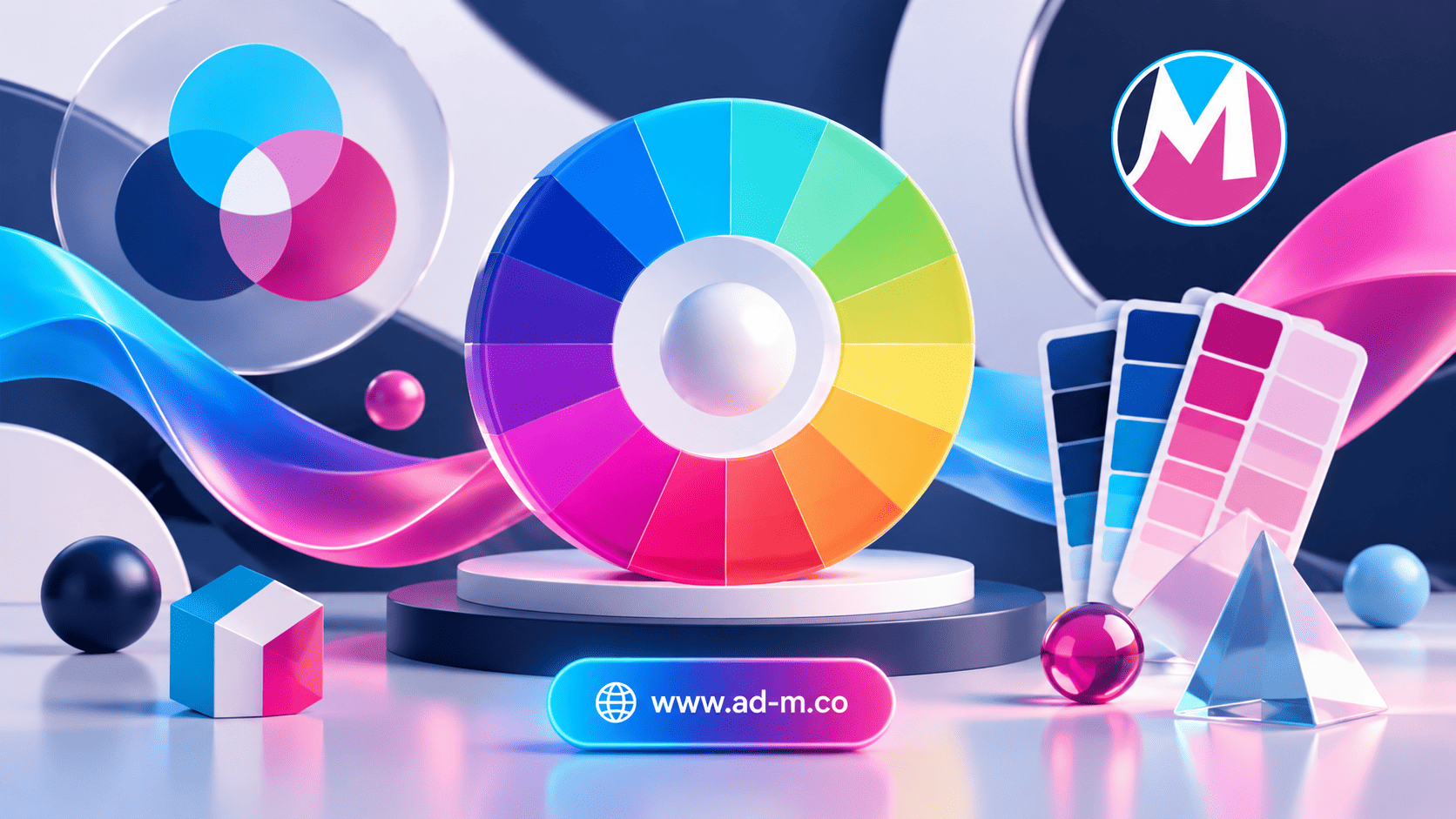
What is Color Theory? The Ultimate Guide to Color Harmonies in Design and Branding
Discover the science of colors, their psychological meanings, and how to professionally combine and coordinate them to create engaging designs that influence customers.
Table of Contents
- 1. Introduction: What is Color Theory and What Is Its Role in Design?
- 2. The Color Wheel and Core Classifications (Primary, Secondary, and Tertiary Colors)
- 3. Psychological Meanings of Colors and Their Impact on Consumer Behavior
- 4. Color Harmony Rules for Building Balanced Visual Palettes
- 5. Frequently Asked Questions (FAQ)
1. Introduction: What is Color Theory and What Is Its Role in Design?
**Color Theory** is the scientific and artistic framework that determines how colors interact with each other and how humans perceive them visually and psychologically. In graphic design and web development, colors are not merely aesthetic choices; rather, they are powerful tools to guide user attention and evoke precise emotions that enhance user experience.
2. The Color Wheel and Core Classifications (Primary, Secondary, and Tertiary Colors)
Color engineering relies on the Color Wheel and is categorized into:
- Primary Colors: Red, yellow, and blue; the foundational colors that cannot be produced by mixing other colors.
- Secondary Colors: Produced by mixing two primary colors together (green, orange, and purple).
- Tertiary Colors: Formed by blending a primary color with a neighboring secondary color on the wheel.
3. Psychological Meanings of Colors and Their Impact on Consumer Behavior
Each color has a unique psychological impact translated by the human mind upon viewing it:
- Red: Evokes excitement, energy, and speed, often used to stimulate quick purchasing.
- Blue: Reflects trust, security, and stability, which is why major institutions and banks prefer it.
- Green: Symbolizes health, nature, and growth, used across eco-friendly and financial stores.
4. Color Harmony Rules for Building Balanced Visual Palettes
To ensure design success, designers rely on established harmony systems such as Complementary colors for strong contrast, or Analogous colors to create a sense of calm and visual harmony.
5. Frequently Asked Questions (FAQ)
What is the maximum recommended number of colors in a brand identity?
It is typically preferred to rely on one primary color, one secondary color, and a maximum of one or two accent colors to ensure the viewer’s attention is not distracted.
How does Maria Deprma apply color theories in its projects?
We choose color palettes with advanced scientific and marketing precision to ensure their seamless compatibility with brand identity and digital user interfaces.
Need to Choose a Professional Color Palette That Enhances Your Brand Presence and Attracts Your Customers?
Get in touch with Maria Deprma’s expert team today to design a vibrant and appealing brand identity for you.




Leave a Reply