
What is line topography?
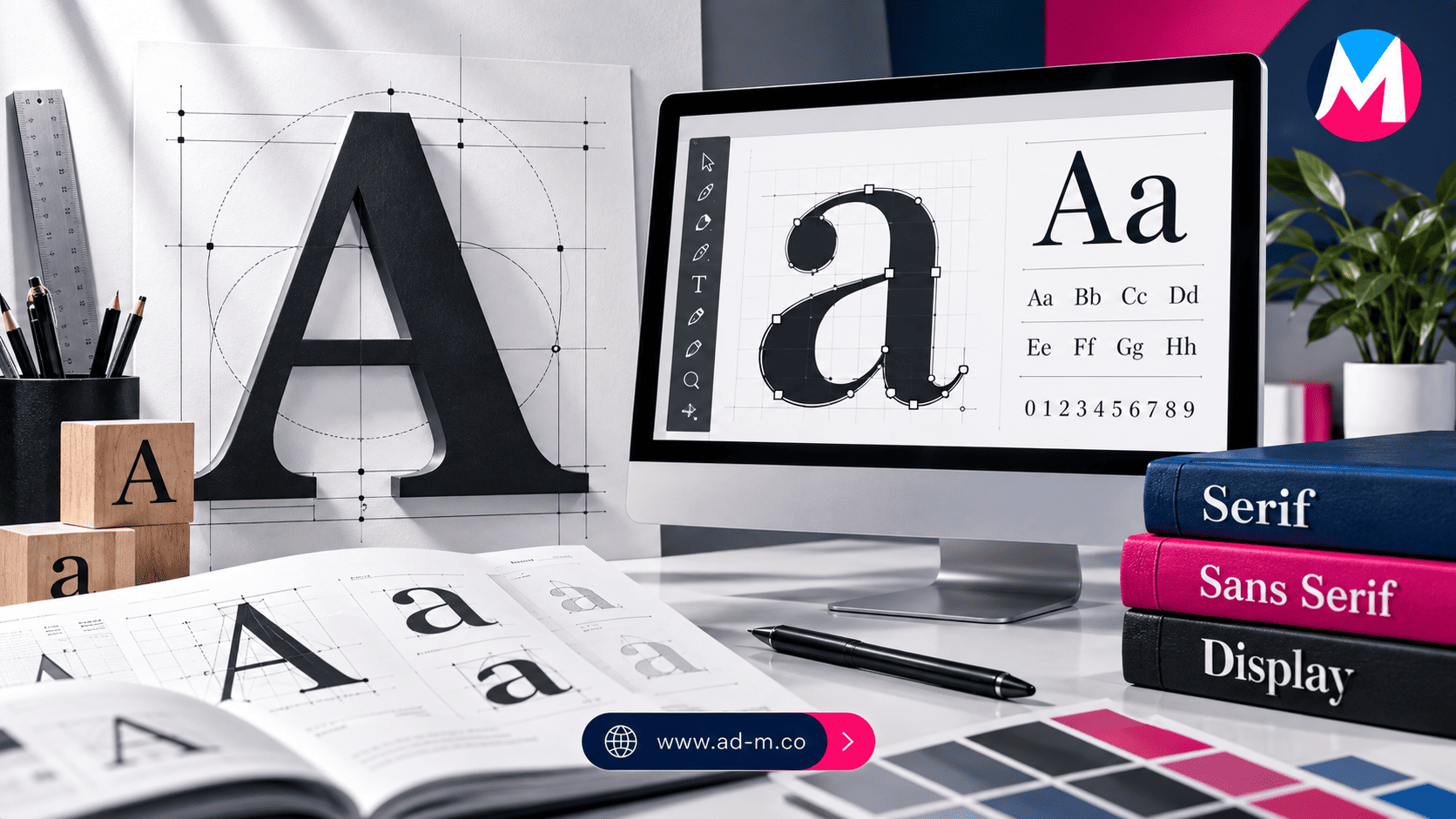
What is Typography? The Ultimate Guide to Font Selection and Usage in Design and Web
Discover the art of font selection and arrangement (Typography) and how font families influence text clarity, visual branding, and user experience across web and print.
Table of Contents
- 1. Introduction: What is Typography and What Is Its Importance?
- 2. Core Font Families and Their Primary Classifications (Serif vs. Sans-Serif)
- 3. Font Selection Rules to Guarantee Seamless Readability and User Experience
- 4. Integrating Digital Fonts Across Websites and E-commerce Stores
- 5. Frequently Asked Questions (FAQ)
1. Introduction: What is Typography and What Is Its Importance?
**Typography** is the art and technique of arranging type and text to make written language legible, clear, and visually appealing when displayed. In visual branding design and web development, font selection is not limited to aesthetic shape alone; rather, it is a core vehicle for conveying a brand’s tone of voice and smoothly guiding the reader’s eye.
2. Core Font Families and Their Primary Classifications (Serif vs. Sans-Serif)
Fonts used in design and printing fall into several primary families:
- Serif Fonts: Characterized by small feet or tails at the ends of letters (such as Times New Roman), conveying a sense of classic tradition, formality, and reliability.
- Sans-Serif Fonts: Clean fonts without structural strokes (such as Arial or Inter), featuring a modern, clean appearance and superior legibility on digital screens.
- Script & Display Fonts: Artistic fonts dedicated to prominent headings and creative logos, rather than long blocks of reading text.
3. Font Selection Rules to Guarantee Seamless Readability and User Experience
To ensure an ideal reading experience, high color contrast between text and background must be maintained, adequate spacing between lines (Line Height) should be applied, and font sizes must scale properly across smart devices and large displays.
4. Integrating Digital Fonts Across Websites and E-commerce Stores
Integrating fonts across web platforms (such as utilizing Google Fonts or specialized web libraries) requires optimizing loading speeds and picking proper font weights to guarantee high performance and SEO search engine compatibility.
5. Frequently Asked Questions (FAQ)
What is the difference between heading fonts and body text fonts?
Heading fonts are bolder and more engaging to capture attention immediately, whereas body text fonts feature high simplicity and clarity to ensure comfortable long-form reading.
How does Maria Deprma handle font selection in web and design projects?
We integrate modern digital typography standards into interface and e-commerce store design to guarantee a distinguished visual identity and a comfortable, exceptional user experience.
Want to Improve Your Site’s User Experience and Choose Professional Fonts Worthy of Your Digital Project’s Identity?
Get in touch with Maria Deprma’s expert team today to design harmonious, eye-friendly web interfaces for you.




Leave a Reply